AI-Powered Corporate Card Management Platform
Redesigning Zeni's card experience end-to-end, from a single virtual-card flow into a scalable multi-card system and shipping an agentic AI CFO that manages cards through conversation.
Overview
One card type, then a whole ecosystem
Zeni is an AI-powered financial operations platform helping businesses manage spending, finance workflows, and company expenses. When I joined the project, Zeni only supported virtual credit cards. As the product evolved, the business needed to expand card offerings by introducing physical credit cards, and later debit cards connected directly to company accounts.
That introduced a real product challenge: how might we scale from a single card experience into a flexible, future-ready card ecosystem without increasing user complexity? As the product designer, I worked end-to-end — designing the experience for new card types, rethinking the creation journey, and building an interface that could keep absorbing future growth.
My role
- Product thinking and workflow design
- User flow definition
- Wireframing and interaction design
- Final UI design
- Card visual design exploration
- Edge case handling
- Design reviews with stakeholders and engineering
- Future-proofing for upcoming card variations
The challenge
Flexibility without decision fatigue
Initially, users had one simple option — a virtual credit card — so the flow was straightforward because there was only one possible path. With new card offerings, users needed the flexibility to create virtual credit, physical credit, virtual debit, and physical debit cards, each with different behaviors and requirements: physical cards needed shipping information, debit cards needed account connectivity, and finance teams often needed to issue cards for themselves or across a whole team.
The challenge was never just adding more options. It was: how do we introduce flexibility without overwhelming users with complexity — while staying scalable for whatever card type came next. Introducing physical cards wasn’t just a UX improvement — it was a business initiative. Enabling physical card usage meant Zeni could increase real-world spending through company-issued cards, driving greater adoption of Zeni’s financial ecosystem, and positioning the platform as a more complete card management solution for growing businesses. That meant the design had to balance business growth goals, operational flexibility, user clarity, technical feasibility, and scalability for future expansion, all at once.
Process
A guided flow, not a bigger form
Before jumping into screens, I focused on how introducing multiple card types would affect the overall experience — how users could tell card types apart, how to avoid decision fatigue from too many options, how physical and virtual experiences should differ, and how the system could keep scaling for card types that didn’t exist yet. One insight shaped everything downstream: simply adding more forms or dropdowns would create confusion. Users needed a guided experience, not additional complexity.
User flow mapping
Mapped the complete lifecycle — card creation → assignment → shipping → activation → usage — to find friction points, dependencies, and where decision-making could be simplified.
Competitive research
Reviewed how leading fintech and banking products handled issuance, physical-vs-virtual, address management, assignment, and activation — not to copy patterns, but to see what created clarity versus friction.
Exploration & iteration
Early explorations introduced too much decision-making upfront. Through stakeholder discussions and UX reviews, the flow converged on one rule: show only what users need at the right moment.
Key Challenges
Designing for present and future
Designing for present + future
The roadmap was still evolving — physical credit cards launched first, debit cards were next. Rather than building separate, disconnected experiences, I designed one unified card-creation framework that could absorb new card types without a redesign each time.
Handling edge cases
Multiple card types created real edge cases — different shipping requirements, multi-user assignment, account-linked debit cards, activation dependencies, conditional workflows. The challenge was making all of that feel simple from the user's side.
Technical feasibility
Some initially designed interactions weren't technically feasible during implementation. That required close collaboration with engineering to rethink solutions while preserving both usability and the original product intent.
The solution
One creation framework, built to scale
The final experience introduced a unified, scalable card-creation journey. Visual card previews replaced a plain list so users could recognize and choose between card types at a glance; the creation flow itself adapted to what a user selected instead of front-loading every possible field.
Before - Card list page
a single, flat card list with no type distinction.
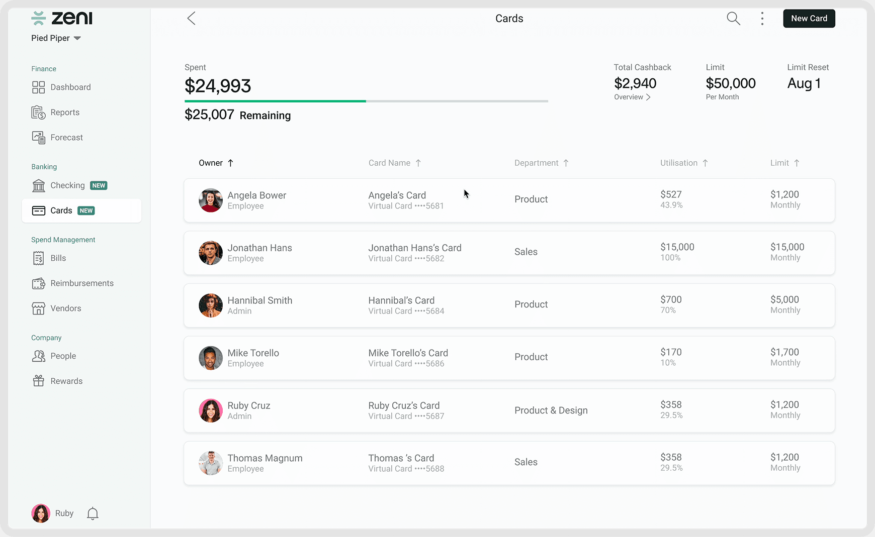
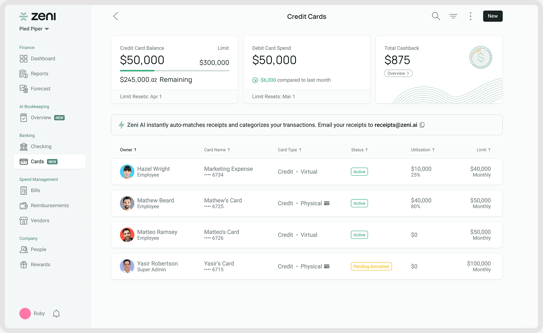
After - Card list page
card type column and a summary strip introduced for credit, debit, and cashback at a glance.
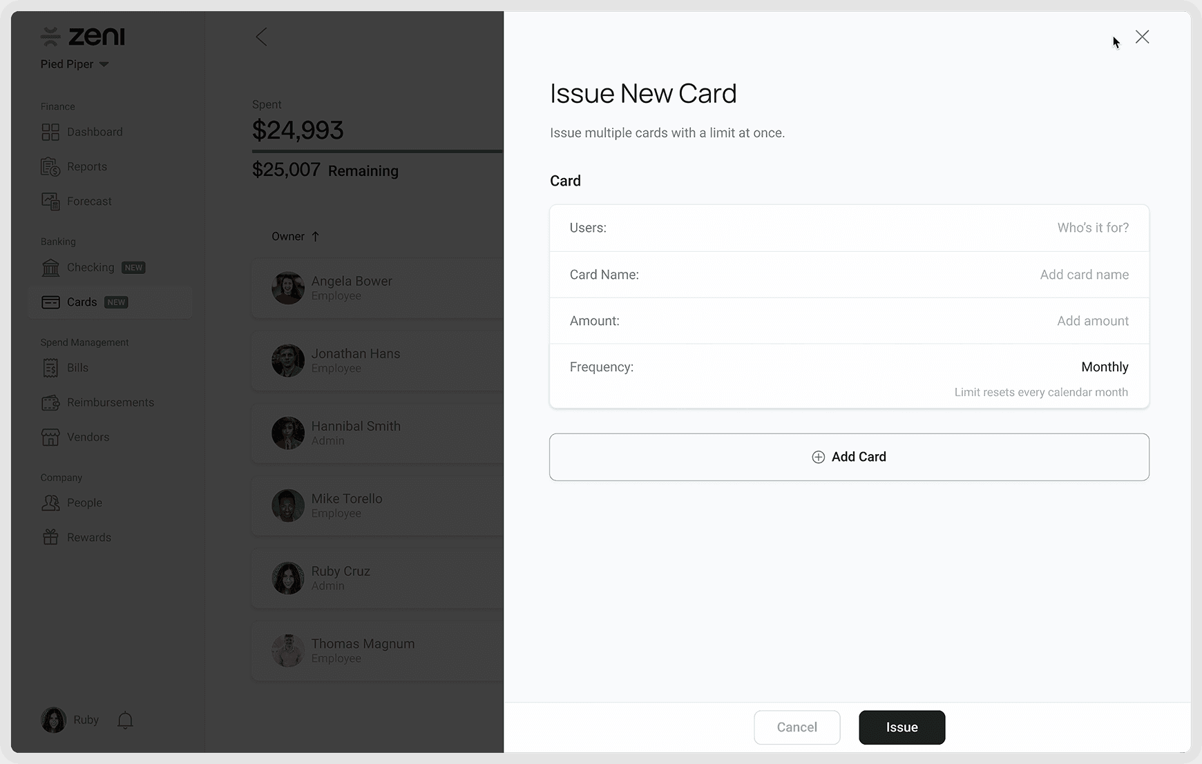
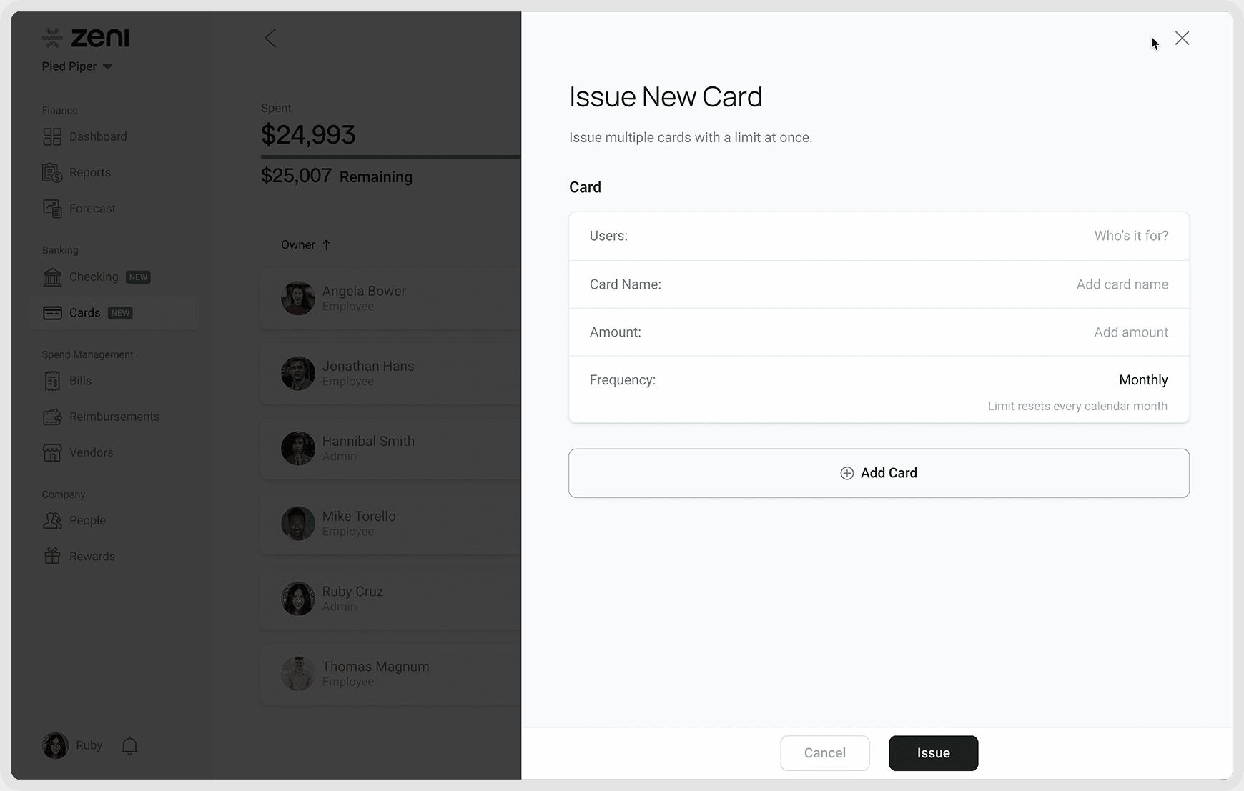
Before - Card Issue page
one generic issuance form, regardless of card type.
After - Card Issue page
a credit/debit, virtual/physical toggle up front, a live card preview, and fields that revamp based on the selection.
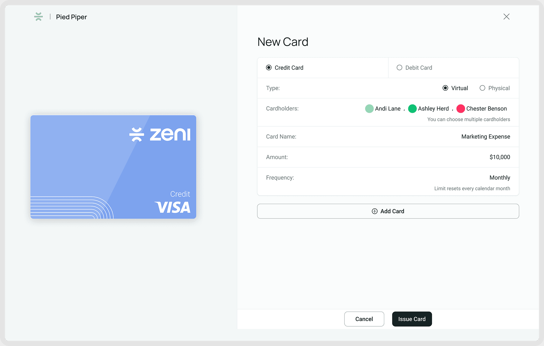
Clear card selection — visual previews replaced a plain list, reducing ambiguity between options.
Guided creation flow — physical cards prompted shipping info only when relevant; debit cards asked for account-linking only when needed.
Multi-user card assignment — finance teams can now assign cards to themselves or other employees more efficiently.
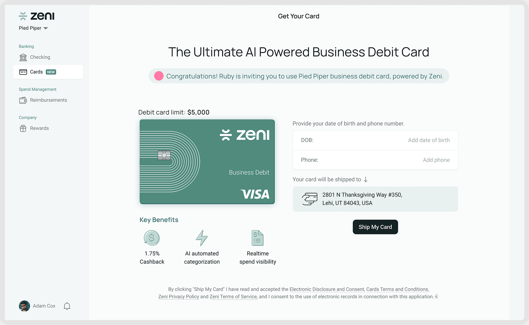
Improved activation journey — redesigned onboarding and activation created better visibility and less friction after issuance.
Before - Card Activation page
one generic issuance form, regardless of card type.
After - Card Activation page
key benefits surfaced up front, one focused action instead of a buried settings flow.
Outcome
What shipped, and what it moved
Once the end-to-end Zeni Cards experience shipped, customer adoption and card spend both grew significantly. Customers using Zeni Cards increased 10x — from 10 to 100 — and monthly card spend grew from $50,000 to $1M, reflecting real, not cosmetic, adoption of the redesigned flow.
Part of that growth traced to one specific decision: customers originally had to contact the finance team manually for a higher spend limit. Introducing a self-serve spend-limit-increase feature, based directly on customer feedback, removed that operational friction and correlated with higher spend per customer.
Key learning
As products scale, complexity increases — but the user experience shouldn’t. Good product design isn’t about exposing every option; it’s about helping users make better decisions with clarity and confidence. Designing for future scalability while maintaining simplicity became one of the biggest learnings from this project.
Final Prototype
Part two - AI CFO for Cards
Designing an agentic AI experience for card management
Managing corporate cards involves repetitive operational tasks. Finance teams often spend time issuing cards, configuring spending controls, assigning ownership, managing vendor-specific expenses, and ensuring policy compliance. These workflows typically require navigating multiple screens, forms, and approval flows.
The opportunity: what if card management could happen through conversation instead of interfaces?
We explored a new interaction model where users could simply chat with an AI CFO and complete operational tasks through natural language — reducing operational friction, improving speed, lowering the learning curve for a complex financial system, and helping finance teams manage a growing card ecosystem efficiently.
Challenge
Designing AI experience for fintech
How might we design an AI experience for financial operations where trust, accuracy, and human oversight matter? Unlike consumer AI products, fintech workflows can’t rely on assumptions — financial actions require precision, explainability, clear confirmation, and operational trust. This wasn’t only designing a chatbot. It was designing an AI operational agent capable of understanding intent, asking intelligent follow-up questions, and completing card management tasks safely.
The solution
Command, clarification, action
Instead of navigating complex menus, users simply describe what they want — for example, “create cards based on our top vendors.” The AI agent interprets intent, analyzes financial context, and initiates an intelligent workflow. Rather than executing blindly, the system reasons through the task and asks contextual questions before taking any action — a balance between automation and accuracy, not automation instead of accuracy.
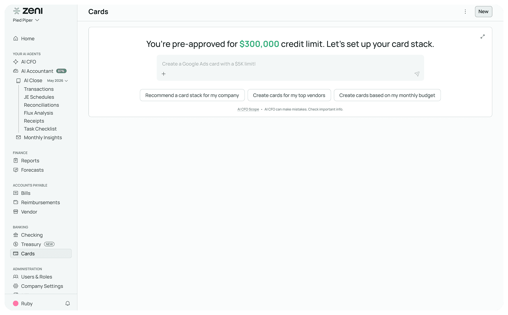
Hero State
a pre-approval headline, a chat input, and suggested prompts so a first-time user isn't staring at a blank box.
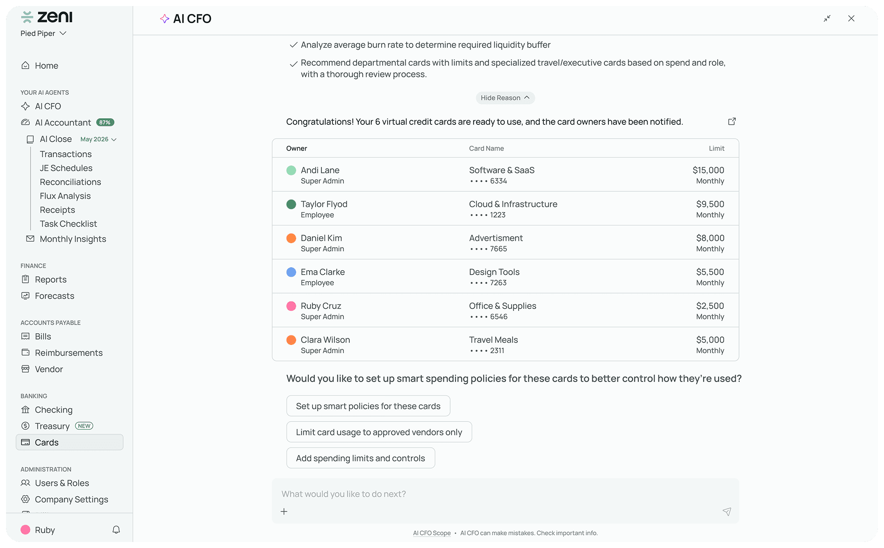
After execution
generated cards, then a follow-up: would you like smart spending policies applied to them?