Rebuilding a grassroots sports platform for web, mobile, and TV
Redesigning SportVot end-to-end — from a poster-style tournament feed into one coherent design system spanning live playback, monetization and grassroots sports data, built for touch, pointer, and D-pad alike.
Overview
One product, three very different screens
SportsVot is a multi-sport OTT platform built for grassroots and community sports in India — live streaming and highlights across cricket, football, kabaddi, basketball, badminton, hockey, and volleyball, with tools for tournament organizers, player profiles with stats, and sponsor visibility. It sits in a market alongside players like FanCode and CricHeroes, but focused specifically on grassroots and community-level sport rather than professional leagues.
The product spans three very different surfaces — sportvot.com on web, the SportsVot mobile app, and SportsVot TV, a 10-foot living-room experience for connected TVs — alongside a sibling app, SportsVot Play, for turf booking with automated match video capture. Redesigning all of it meant building one design language that could flex across touch, pointer, and D-pad without fragmenting into three separate products.
My role
- Information architecture across web, mobile, and TV
- Design system architecture — tokens and a shared component library
- Platform-specific interaction design for touch, pointer, and D-pad
- Live playback, monetization, and account flows, end-to-end
- Production-ready specs handed directly to engineering
The problem
A poster feed, not a streaming product
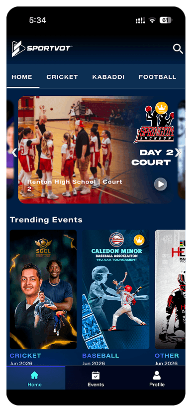
The clearest way to see the problem was the old home screen itself.
No product identity — the hero and event cards were essentially raw tournament flyers uploaded by organizers, each with its own font, crop, and color treatment, because every one was designed independently outside the app.
No real status signaling — a gold crown badge sat on both the hero and every event card with no clear meaning, not obviously live, premium, or featured. Viewers had to read overlay text to figure out if something was happening now.
Flat information hierarchy — the hero banner and grid cards competed for the same attention, with the one primary action buried inside the image itself instead of being an actual button.
No personalization — a single generic grid and nothing else: no continue-watching, no followed teams or players, nothing that made the app feel like it knew who was using it.
Search and account access fought for space inconsistently — search lived as a small icon, profile lived in the bottom tab bar, an odd split for two very differently-used actions.
Goal
What good looked like going in
- One consistent visual and interaction language across web, mobile, and TV.
- A documented, reusable design system that scales to new sports and screens without one-off components.
- A TV experience actually designed for 10-foot viewing and D-pad navigation — not a scaled-down phone screen.
Before/After
Mobile home screen
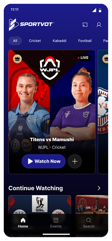
Visual system — one consistent card template now wraps any photo or art asset; the app has its own visual identity regardless of what content comes in from organizers.
Status signaling — an explicit red LIVE badge replaces the ambiguous crown; the badge now means one specific thing.
Hierarchy — one clear hero match with real metadata and a primary Watch Now CTA, instead of hero and grid competing equally for attention.
Personalization — a new Continue Watching row gives the app a return-visit pattern the old IA didn't have at all.
Navigation — sport filters became a scrollable pill row that scales to new sports without redesigning the header; search moved to the higher-frequency bottom tab, profile to a lower-frequency header icon.
Cross-platform hook — a cast icon in the header surfaces the mobile-to-TV relationship at the exact moment it's useful, right before watching something.
Before
After
Process
One system, three input models
The hardest part wasn’t making three platforms look related — it was making the same system genuinely fit touch, a mouse and keyboard, and a remote control, each with their own tolerance for density and their own primary input method.
Web — where the system gets denser
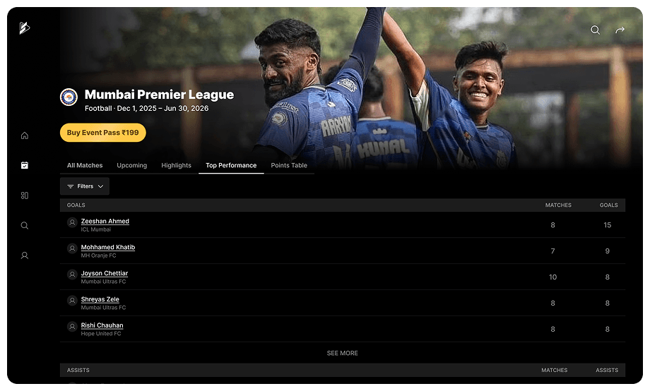
On web, the Event Page carries a full sortable leaderboard — Goals, Assists, Saves, each with match counts — directly in the page, since mouse-and-keyboard use tolerates that density and a returning organizer or scout genuinely wants it. The live-match screen pairs a persistent scorecard panel next to the video rather than hiding it behind a tab, and monetization gets real e-commerce treatment: a Match Pass vs. Event Pass pricing modal with coupon support and an itemized summary — the kind of checkout UX you’d expect from a ticketing product, not a bolted-on paywall.
Mobile — single-hand, single-glance
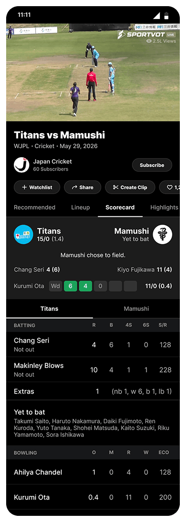
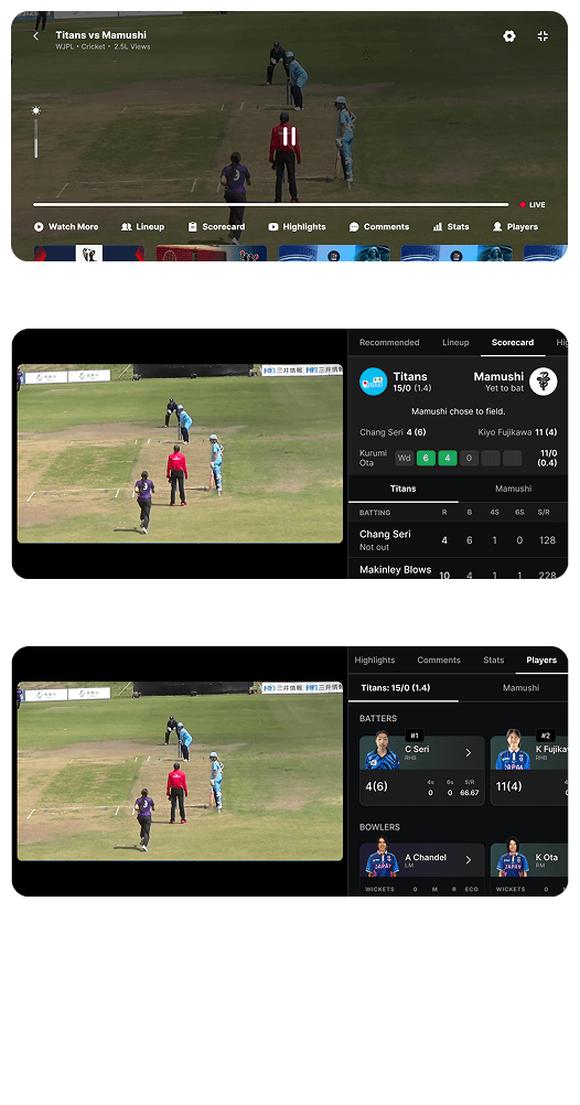
Mobile is built around single-hand, single-glance use: a sparse live-player overlay — just transport controls and a LIVE badge — with the dense stuff (scorecard, lineup, comments, stats) living in tabs below the fold instead of over the video. Landscape gets two distinct modes rather than a stretched portrait layout: a full tab-bar version for active viewing, and a split-panel version — video and a persistent scorecard side by side — that reads like a second-screen moment, meant for a break in play.
TV — the hardest of the three
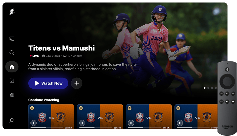
Focus states are real, not implied — the active nav icon on the TV home screen carries a visible ring, the one piece of UI a D-pad interface can’t function without. The same data gets a different shape: the Event Page’s dense leaderboard becomes a large-card grid on TV, a legibility call, not a style choice — a six-column table is unreadable from a couch. Controls shrink to match the input: mobile’s seven-item player tab bar becomes one control, “Watch More,” on TV, since every additional target is another D-pad press away. And search gets its own interaction model entirely — a full on-screen QWERTY keyboard with a voice-search fallback, since there’s no physical keyboard to fall back on.
Design system
102 screens and states, one system
Pulled directly from the mobile Figma file: 102 named top-level screens and states across the areas below — the clearest evidence of scope, real rather than estimated.
- Discovery & navigation
- Home, Events, sport-filtered Events tabs, Search (rest / typing / clicked states), Channel pages.
- Live & VOD playback
- Player controls for Live, Settings, and VOD, including Pause and Seek — each with a full landscape counterpart.
- Match & event detail
- Event Page — All Matches, Upcoming (+ empty state), Highlights, Top Performance (+ filter states), and an explicit long-event-name edge case.
- Player & athlete profiles
- Player Profile — All Matches, Highlights, Stats, sport-specific views; Scorecard, Lineup, Comments (+ empty state), Player Highlights.
- Monetization
- Paywall flows for Free Preview Ended, No Free Preview, and Free Preview Gateway — each with a plan-selection sheet and landscape equivalent.
- Account & identity
- Profile, Post-Login, Help & Settings, My Passes, Transaction Activity, Delete Account, and a full OTP flow.
- Content creation
- Trim Clip / Create Clip — lets a fan cut and share their own highlight from a match.
Landscape isn't an afterthought
Nine separate player-control states have dedicated landscape frames — the same discipline a TV design needs, built into the phone experience too.
Monetization has real UX
A tournament page has a clear “Buy Event Pass” CTA directly in the header, above the match list pricing & access as a first-class part of discovery, not a modal that interrupts it.
Edge cases were designed, not guessed
Empty states for Upcoming Matches and Comments, a long-event-name overflow case, and a full account-deletion flow all show up as explicit frames.
Key screens
Evidence, not just a system diagram
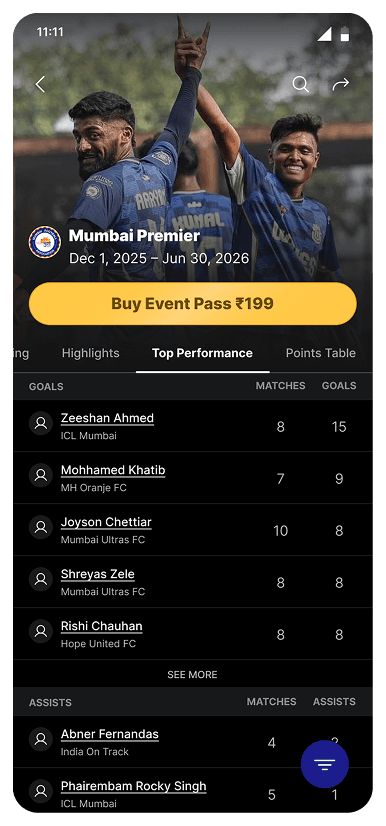
Event detail page
A genuinely dense stat leaderboard — Goals, Assists, Saves, each sortable by matches — real sports-data UX, not a mocked-up table.
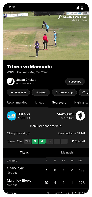
Player detail page
The core “watching a match” screen: channel identity, a ball-by-ball scorecard, and a Watchlist / Share / Create Clip / Like action row.
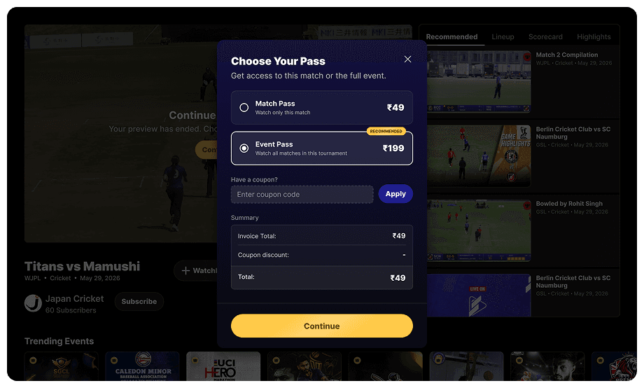
Web Price modal pop-up
The clearest monetization UX in the system — single-match vs. full-event pricing, a coupon field, and an itemized summary before checkout.
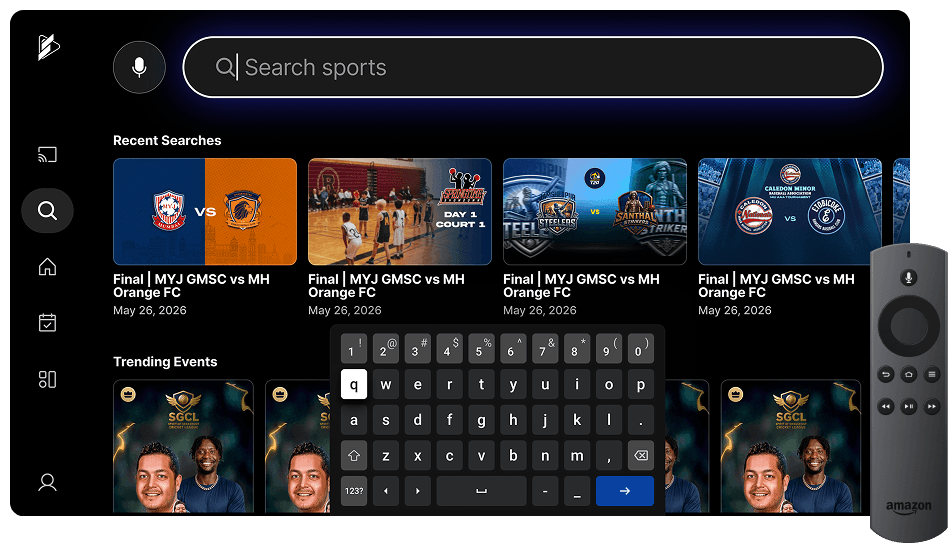
TV Search experience
The strongest single signal that this was actually designed for TV — an on-screen keyboard with voice search is a pattern nobody builds for a device with a physical keyboard attached.
The tell
The same Event Page that gets a dense sortable leaderboard on web gets a big-card grid on TV — a legibility call, not a style choice. You can tell the platforms apart by their interaction affordances, not their color palette — which is what a real cross-platform design system actually looks like.